INTRODUCTION.

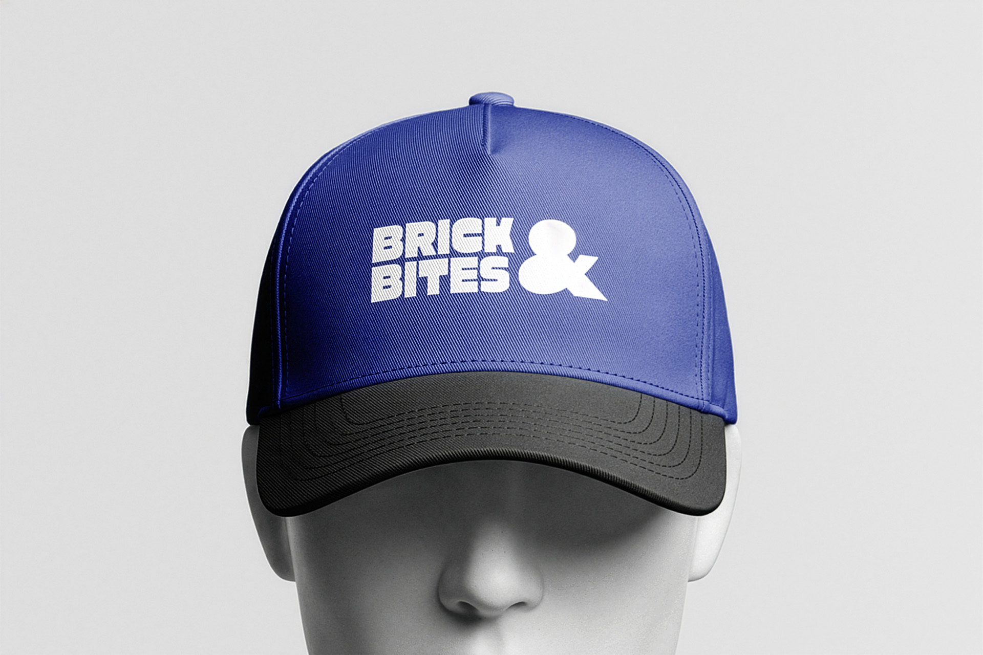
Brick & Bites is a modern Sandwich Shop focused at bold visuals to fit in with an younger audience.

TECHNIQUE.

Adobe Illustrator, Adobe InDesign, Adobe Photoshop

PROJECT.

Branding, Logodesign, Plakatkampage, Packaging-Design, Corporate Design

CLIENT.

Self-Initiated Project

Chapter 01

Overview

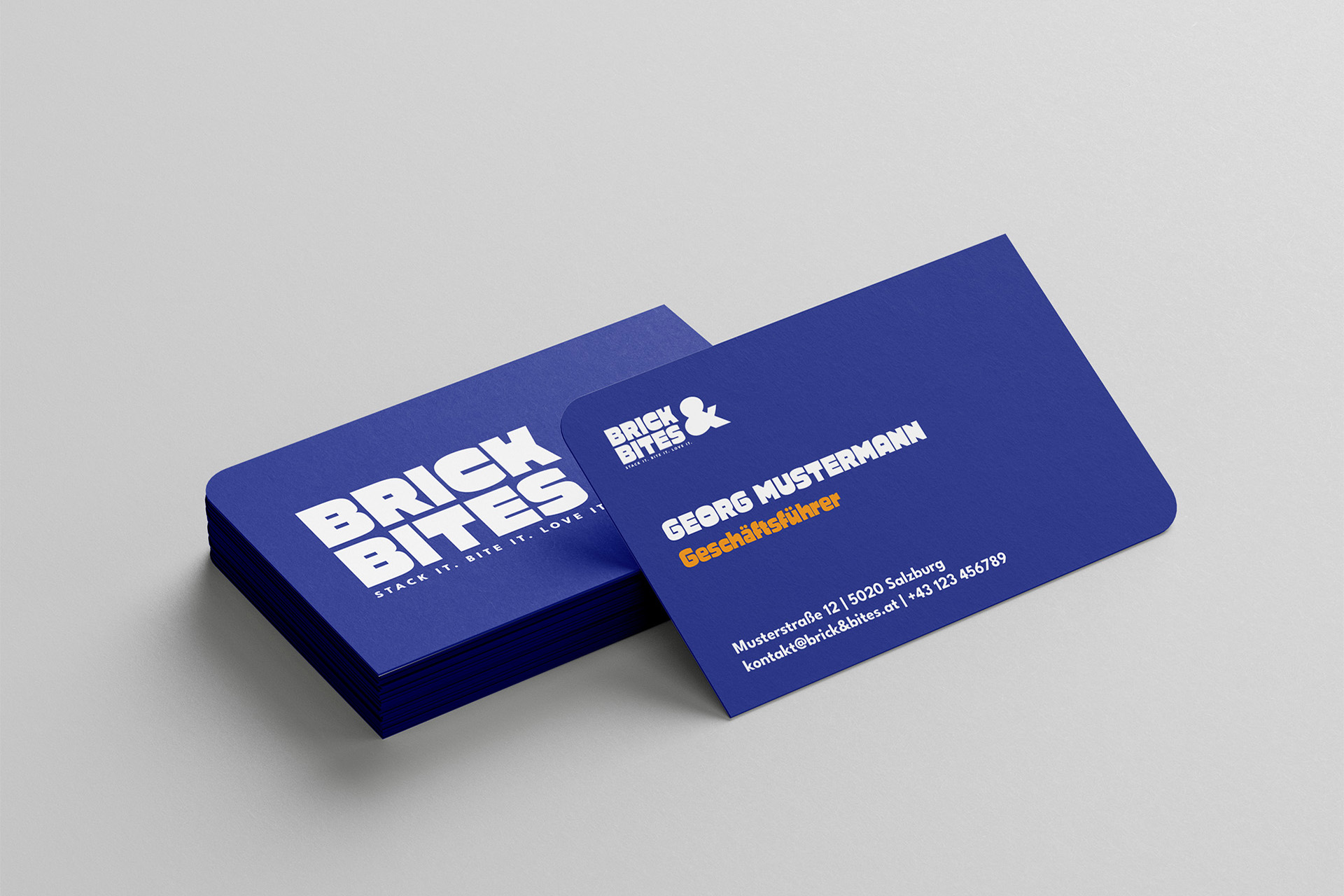
The task was to create a complete brand identity for the fictional sandwich shop BRICK & BITES, including a range of print materials such as posters, business cards, menus, and promotional collateral.

As a self-initiated project, the concept and creative direction were developed independently. A primary objective was to design a brand that feels playful, distinctive, and highly recognizable, setting it apart from competitors in a crowded market.
Chapter 02

Name Idea.

The word „BRICK“ originated from thinking about how a sandwich is assembled. Since a sandwich is built layer by layer, from the bottom slice of bread to the top, it reminded me of how a brick wall is constructed, with each element carefully stacked on top of the next.

The word „BITES“ was added to complement „BRICK“ and create a name that sounds catchy, memorable, and directly connected to food. Together, the two words form a playful and distinctive brand name that reflects both the construction and enjoyment of a sandwich.

Chapter 03

Execution.

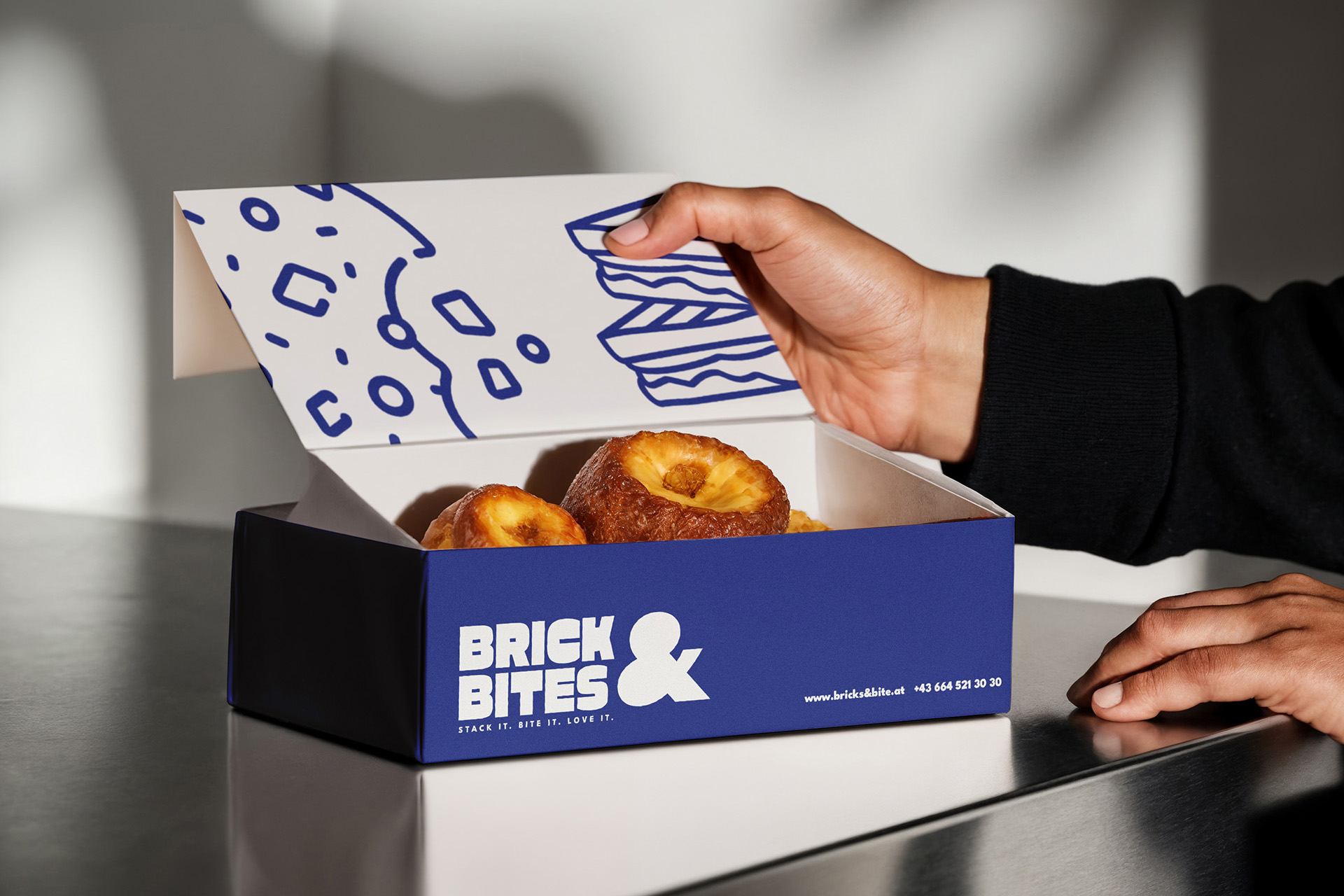
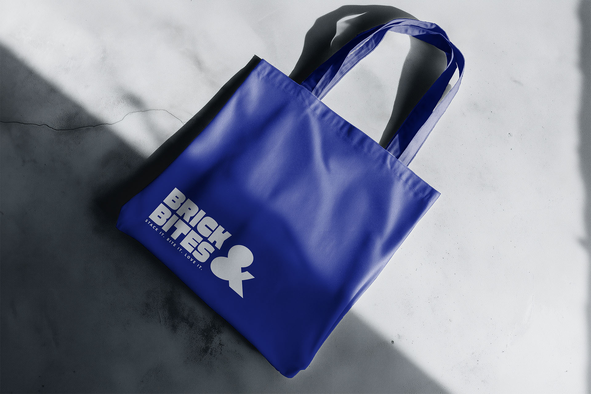
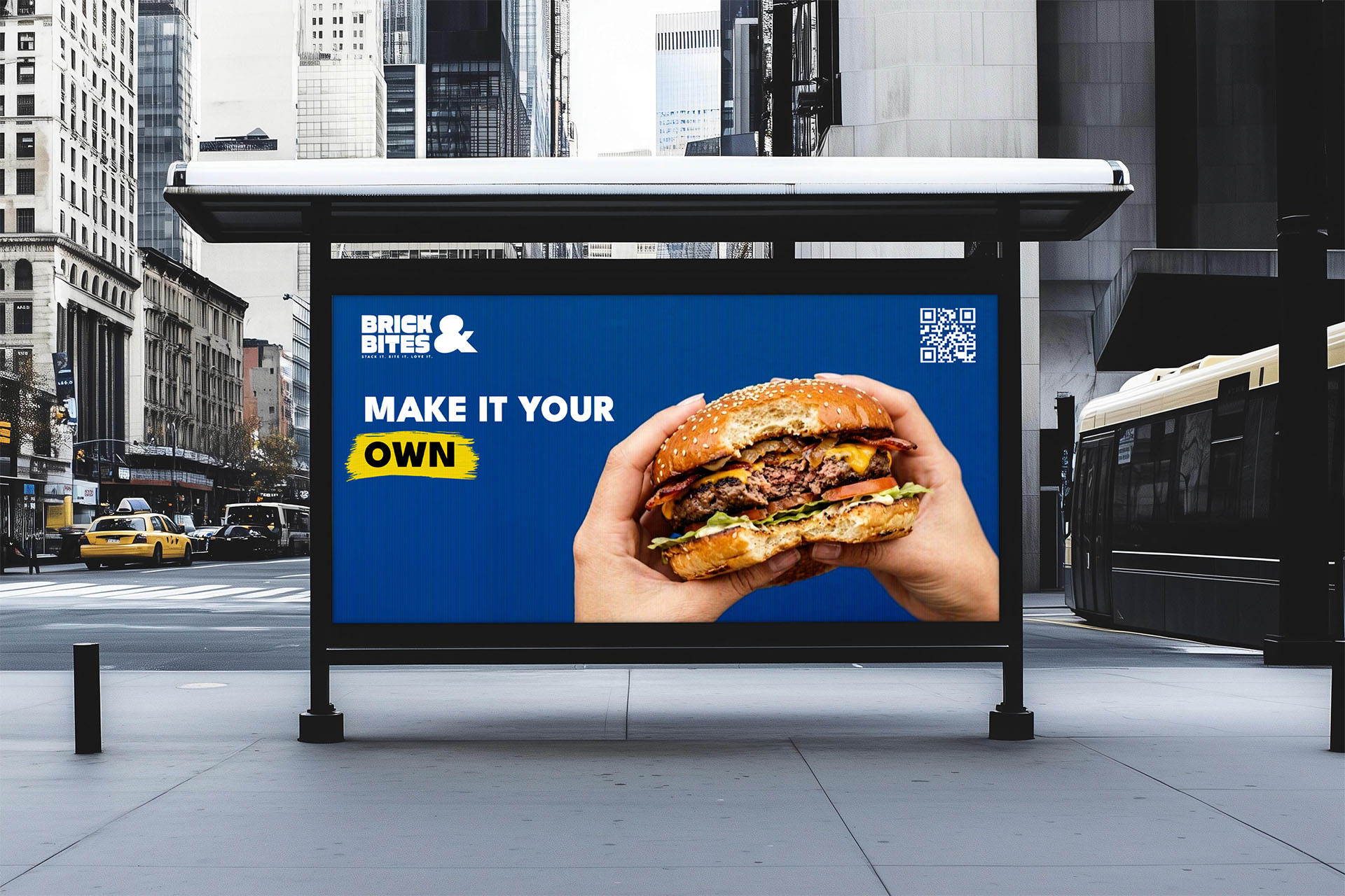
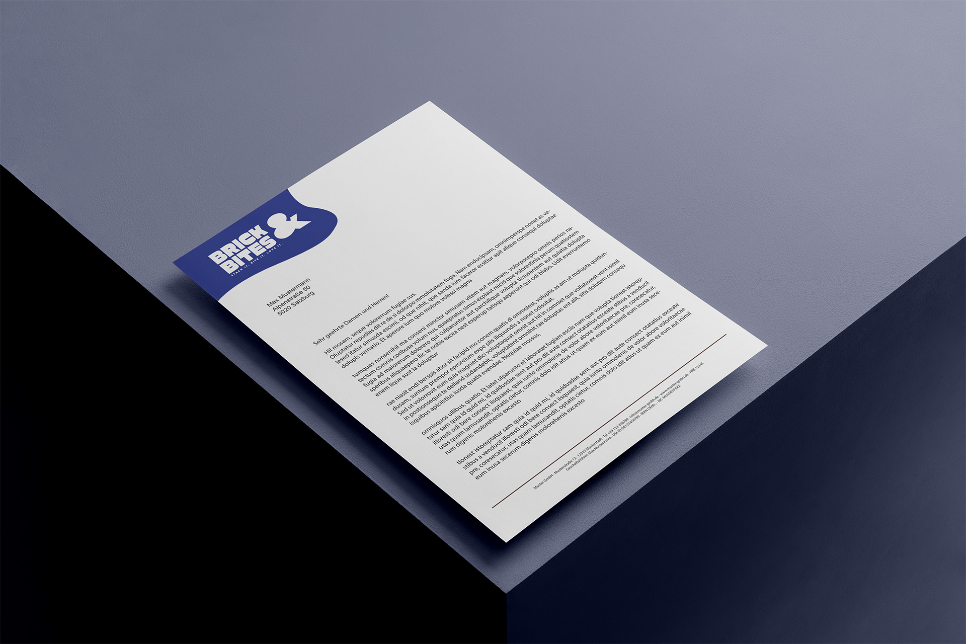
Building on the logo and brand color palette, I created a cohesive corporate identity across a range of brand touchpoints, including:

  • Campaign posters

  • Packaging design

  • Business cards

  • Menu design

  • A4 stationery